If you’ve ever stood in front of your closet wondering why certain outfits just don’t look right, you’re not alone. Mastering color matching for men is one of the most overlooked skills in modern style—yet it’s often the difference between looking put-together and looking forgettable. This article is designed to give you clear, practical guidance on how to combine colors with confidence, whether you’re dressing for work, weekends, or special occasions.
We break down the core principles of color coordination, from understanding undertones and contrast to pairing neutrals with statement shades. You’ll learn simple frameworks you can apply immediately—no fashion degree required.
Our approach is grounded in established color theory, real-world styling experience, and trend analysis across men’s fashion and grooming. Instead of vague rules, you’ll get actionable insights that make getting dressed easier, sharper, and more intentional every single day.
Most men know the frustration: you stand in front of your closet and grab the same blue shirt and black jeans. Safe. Predictable. Forgettable.
The real problem isn’t taste—it’s uncertainty. When you’re unsure about colors, you either clash loudly or fade into the background. Neither builds confidence.
This guide gives you a simple system for color matching for men, so you stop guessing and start choosing with intent. Instead of random outfits, you’ll create combinations that feel sharp and natural.
What’s in it for you?
• Faster mornings
• A wardrobe that stretches further
• Quiet confidence
Style becomes automatic.
The Color Wheel: Your Secret Style Weapon
Once you’ve grasped the essentials of color matching, you’ll find it much easier to curate a cohesive and stylish wardrobe, which is a perfect segue into understanding How to Build a Capsule Wardrobe That Always Looks Sharp.
Think of the color wheel as a GPS for your wardrobe. It’s not abstract art theory—it’s a map that shows you where colors live and how they travel together. At its core are the primary colors: red, yellow, and blue. These are the building blocks. Mix them, and you get secondary colors: green, orange, and purple. Blend those again and you create tertiary colors, the in‑between shades that add personality.
Here’s where it gets practical. A hue is the pure color itself—blue is blue. Saturation is the intensity (neon vs. muted). Value is how light or dark a color is.
Think of value like volume on a speaker. You can play the same song—say, blue—but at different levels. A light blue shirt paired with navy trousers works because you’re keeping the hue consistent while adjusting the value. That’s a monochromatic look, and it’s a cornerstone of color matching for men (clean, sharp, quietly confident).
Some guys argue this is overthinking it. “Just wear what looks good.” Fair. But the color wheel is like a cheat code—once you see the pattern, getting dressed feels less like guesswork and more like strategy. Pro tip: when in doubt, lower saturation for a more refined vibe.
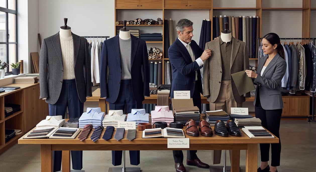
Three Foolproof Color Schemes for Any Occasion
Great style isn’t about owning more clothes. It’s about knowing how to combine what you already have. Most guides stop at basic color theory. Let’s go a step further and talk about how these schemes actually function in real life—on different skin tones, in different settings, and under different lighting (yes, office fluorescents matter).
1. Monochromatic
Monochromatic means wearing different shades and tints of a single color. Think navy chinos, a sky blue shirt, and a royal blue sweater. Because there’s no harsh contrast, the eye moves vertically, creating a streamlined, slimming effect.
Some argue it’s boring. But that usually happens when texture is ignored. Wool, denim, and cotton in the same color family create depth without chaos. Pro tip: Mix at least two distinct fabrics to avoid looking flat.
This approach is especially effective for formal settings and photos (ever notice how celebrities default to tonal looks on press tours?). It’s controlled, confident, and quietly powerful.
2. Analogous
Analogous colors sit next to each other on the color wheel. A green jacket over a blue shirt with dark denim creates a harmonious, low-contrast look. It feels intentional without trying too hard.
Critics might say it lacks punch. That’s the point. Analogous combinations are ideal when you want polish without shouting for attention. They work exceptionally well in business-casual environments and date nights where subtlety wins.
The overlooked advantage? This scheme adapts seamlessly across seasons. Earthy greens and blues in fall; lighter variations in spring. Few style guides mention this flexibility.
3. Complementary
Complementary colors sit opposite each other on the wheel. Blue and orange. Red and green. High contrast, high impact. The key is restraint: choose one dominant color and use the opposite as an accent. A navy suit with a burnt orange pocket square or tie is sharp, not circus-level loud.
Some think complementary equals flashy. Not if proportion is controlled. Use color matching for men strategically—90% neutral, 10% contrast—and you’ll command attention without overwhelming the room.
And remember, even the best palette falls apart without fit. Master the fundamentals with tailoring tips how fit transforms your entire look. Color gets noticed. Fit gets remembered.
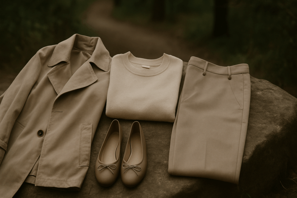
Start with Neutrals: The Backbone of Your Wardrobe
If your outfits feel inconsistent, start here: build around neutrals. Black, white, gray, navy, beige (or khaki), and olive green are your core players. Think of them as the canvas—everything else is just paint. When your base is steady, adding personality becomes effortless.
Here’s my recommendation: begin every outfit with one or two neutral pieces. A white T-shirt and gray trousers. Navy chinos and a beige overshirt. Once that foundation is set, layer in a single color piece—a burgundy bomber, forest green sneakers, even a muted rust cap. It won’t clash because the base is doing the heavy lifting.
This “Neutral Foundation” rule simplifies color matching for men without turning you into a walking paint swatch (no one wants to look like a middle school art project).
Classic neutral-only combinations to try:
- Black jeans + white tee + gray sneakers
- Navy chinos + light blue Oxford + brown loafers
- Olive jacket + beige tee + dark denim
Notice something? No loud colors, yet each outfit feels intentional.
Pro tip: If you’re rebuilding your closet, invest first in high-quality neutral staples before experimenting. Trends fade, but a sharp navy blazer never does. Keep it simple, sharp, and repeatable.
Simple Rules and Common Color Mistakes
First, let’s simplify the math. The 60-30-10 rule means 60% of your outfit is the main color (usually your suit or trousers), 30% is secondary (your shirt), and 10% is the accent (tie or pocket square). In other words, one color leads, the others support.
Next, match your leathers. Your belt, shoes, and watch strap should sit in the same color family—black with black, brown with brown. No exceptions.
However, avoid wearing too many bold shades at once. Let one color be the hero.
Finally, consider skin tone. The right shades enhance you; the wrong ones drain you. That’s smart color matching for men.
Develop Your Color Confidence
First, let’s clear something up: great style isn’t magic—it’s a skill. And color coordination is learnable. In simple terms, a neutral base means starting with versatile shades like navy, gray, black, or beige. From there, you add structured color schemes:
- Monochromatic: different shades of the same color
- Analogous: colors that sit next to each other on the color wheel
This approach removes guesswork from color matching for men.
Some argue bold color is risky. Actually, randomness is risky. Strategy isn’t.
So this week, try one new combination—even just a burgundy pocket square.
Mastering color isn’t extra. It’s identity, worn well.
Mastering Color Matching for Men Starts Now
You came here to finally understand how color matching for men works—and now you have the blueprint. From pairing neutrals with confidence to using complementary tones that sharpen your presence, you’re no longer guessing. You understand how the right combinations elevate your style, simplify your wardrobe, and eliminate the frustration of outfits that just don’t feel right.
The truth is, most men struggle with looking put-together because they ignore one key skill: intentional color matching for men. When your colors clash, your confidence dips. When they align, everything changes—your presence, your first impressions, even how you carry yourself.
Now it’s time to act. Audit your wardrobe today. Start with versatile base colors, build around them, and experiment with one bold complementary piece at a time. If you’re serious about upgrading your look without wasting money on clothes that don’t work, follow our proven style breakdowns and gear guides trusted by thousands of modern men. Don’t settle for average—refine your style, sharpen your image, and step out knowing every color you wear works for you.
 Michaelo Taylorawsons brings a refined and confident voice to Impocoolmom, with a strong focus on modern men’s lifestyle, personal presentation, and everyday self-improvement. His writing explores the balance between timeless masculinity and current trends, offering readers practical insights on grooming, wellness, style choices, and lifestyle upgrades that feel both relevant and easy to apply.